Via the Stallion Responsive “Color Scheme CSS Inline Creator” (options page under Appearance for changing fonts colors AND font types inline) or via the “Font Scheme CSS File Creator” (options page under Appearance for creating new font scheme CSS files).
The former is inline CSS, for quick minor font type and color modifications, the latter is for changing the entire font selections (creates a new CSS file).
Access the Stallion Responsive Colour and Font Scheme features under
“Colour Scheme CSS Inline ON” = Use an inline version for creating font colors AND font types. “Colour Scheme CSS File Creator ON” = Use the CSS file version, creates and saves new color scheme CSS files (only for font colors, NOT font types).
“Font Scheme CSS File Creator ON” = Use the CSS file version, creates and saves new color scheme CSS files (only for font colors, NOT font types).
Tutorial needs updating: after writing this article the font part of the feature was split into a separate feature so font colors and font types could be created independently (resulting in many more combinations).
Both features use the same options for fonts, every part of a Stallion Responsive site can have it’s colours and fonts set by the site owner, if you want a weird font for your comments it’s possible without fully understanding CSS (or PHP), the options pages are a set of boxes for setting colours and fonts. On this page I’ll be dealing with setting fonts only, there’s currently 36 elements that can have their fonts set.
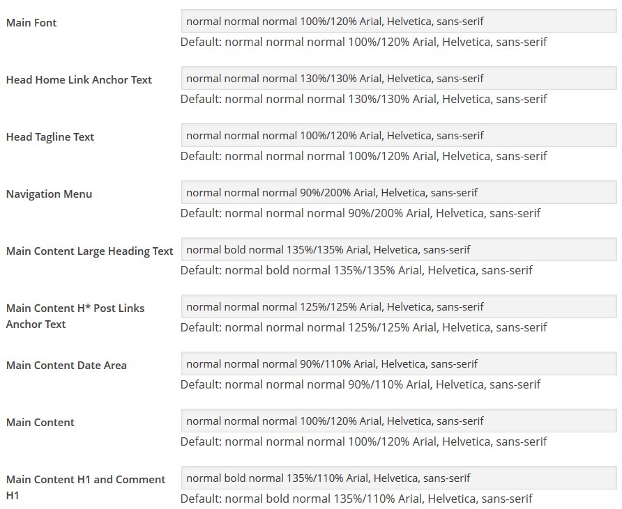
Stallion Responsive Theme Fonts that Can Be Changed
Main Font Head Home Link Anchor Text Head Tagline Text Navigation Menu Main Content Large Heading Text Main Content H* Post Links Anchor Text Main Content Date Area Main Content Main Content H1 and Comment H1 Main Content H2 and Comment H2 Main Content H3 and Comment H3 Main Content H4 and Comment H4 Main Content H5 and Comment H5 Main Content H6 and Comment H6 Main Content Blockquote Main Content Blockquote Cite Main Content Code Main Content Pre Main Comment Button Links Anchor Text Author Biography Box Comment Main Headings Text Comment Form Comments Comment Title Text (Comments with Titles) Comment Blockquote Comment Blockquote Cite Comment Code Comment Pre Widgets Widget Heading Tagcloud Widget Links Gallery HoverOver Caption Image Caption Footer Area Featured Slider Next and Previous Links
Setting Theme Fonts
Setting fonts within the Stallion Responsive Theme Colour CSS Selector or Colour Scheme CSS Creator can be a little confusing because there’s so many ways font CSS code can be generated and if you mix the formats you can get unexpected results. For this reason it’s advisable to always use the same format and list all 5 font properties even though in theory you could list as few as one (ie just font-size).
Stallion Responsive CSS files use the following CSS rule format:
Example CSS rules
normal normal normal 100%/120% Arial, Helvetica, sans-serif
italic normal normal 100%/120% Georgia, 'Bitstream Charter', serif
normal bold normal 135%/110% Arial, Helvetica, sans-serif
The code above is what you enter into the Stallion Responsive options page, the output adds font: and ; to form correctly formatted CSS rules:
Stallion fonts can be set on the CSS Creator Options page…
font: normal normal normal 100%/120% Arial, Helvetica, sans-serif;
The above code is what the CSS rules look like in the CSS file.
To understand these font rules let’s break down an example
italic bold normal 135%/110% Arial, Helvetica, sans-serif
This means
italic – font-style : it’s italic text. bold – font-weight : looks thicker/bolder than normal). normal – font-variant : unlikely you’ll need to change this, it’s different font versions for dropdown menus etc… 135% – font-size : the text size is 135% of ‘normal’, setting to % means a user can resize the text via their browser which is good for usability. 110% – /line-height : that’s 110% of whatever the font-size is, this means the line height is 10% taller than the actual text, though some elements like headers already have extra large line height, so you might not get exactly what you’d expect. Also if the text has a border (like the widget headings) you’ll need to set quite tall lines so the borders aren’t hugging the text. Arial, Helvetica, sans-serif – font-family : the browser will look for Ariel, if it’s not on the system it looks for the other fonts.
To prevent confusion it’s recommended to use the same format, you’ll see on the Stallion Responsive options page the defaults all use the same format.
This is not the only way to generate fonts within the theme options page, but the format (italic bold normal 135%/110% Arial, Helvetica, sans-serif) works.
If you set all five font options it works every time, miss one option (for example “italic 100% sans-serif” which is missing font-variant, font-weight and line-height) in theory should work, but depends which font box it’s added to (sometimes it works, sometimes not), so best to always add all five options.
That being said if you want to experiment with different formats below are most variants that can be used to build fonts, be warned before I used the above format I tried mixing different formats I know work when added to CSS files in particular circumstances, but there’s so many font options working and clashing together in Stallion (so we have full control) I didn’t get consistent results (wasted hours trying different formats).
Font Property Options
The five font properties that can be set, are (in order): font-style font-weight font-variant font-size/line-height font-family.
font-style – overall styling like italic normal – normal font style italic – italic font style oblique – oblique font style inherit – inherited from the parent element
font-weight – how thick characters should be normal – normal characters bold – thick characters bolder – thicker characters lighter – lighter characters inherit – inherited from the parent element or 100, 200, 300, 400, 500, 600, 700, 800, 900 from thin to thick characters. 400 is the same as normal, 700 is the same as bold
font-variant normal – normal version of font small-caps – small-caps version of font inherit – inherited from the parent element
font-size/line-height font-size – size of characters xx-small – xx-small size x-small – extra small size small – small size medium – medium size (default) large – large size x-large – extra large size xx-large – xx-large size smaller – smaller size than the parent element larger – larger size than the parent element length – fixed size in px, cm, etc. % – percent of the parent element font size inherit – inherited from the parent element line-height – height of each line of text /16px /20px /1.4em /1.5em /2.0em /90% /200% etc…
font-family serif sans-serif monospace etc…
A font family can also be a list of fonts (a family) a browser will try to load from left to right, for example if you set a font family to ‘Times New Roman’, Times, serif and the ‘Times New Roman’ font is missing from a users system the browser will try to load Times, if that is missing it will look for the serif font. It is therefore important to set the last font to something all systems will have access to like serif, sans-serif or monospace (there are others that are common to most systems).
There are many font lists online below are a few common examples.
Common Web Safe Font Family Combinations Serif Fonts Georgia, serif ‘Palatino Linotype’, ‘Book Antiqua’, Palatino, serif ‘Times New Roman’, Times, serif
For multiple word fonts like Times New Roman please surround with single quotes ‘Times New Roman’ NOT double quotes “Times New Roman”. You will find most online font-family lists will use double quotes “font-family”, but the Stallion Responsive options page doesn’t play nice with double quotes so always use single quotes.
If you aren’t familiar with adding quotes around fonts, the rule is any font with white space (like Times New Roman) is surrounded by quotes (“Times New Roman” or ‘Times New Roman’), single word fonts and hyphenated fonts (sans-serif for example) do not require being surrounded by quote.
David Law
David Law > AKA SEO Dave
: 20+ Years Experience as a Freelance SEO Consultant, WordPress SEO Expert, Internet Marketer, Developer of Multiple WordPress SEO Plugins/SEO Themes Including the Stallion Responsive Theme.
“Stallion Theme Colour : Choose from one of the 24 Stallion theme colours. You can test the colours back clicking the links under the “Stallion Colour Switcher” menu on the right of this site.”
Did you take it out of the sidebar? I don’t see it.
I was doing an update and testing a new Stallion 7.1 feature and the Chameleon CSS Plugin (used to make the colour switcher) stopped the new feature working correctly, I disabled the plugin for the tests and it deleted the widget I’d built (stupid plugin)!
Stallion 7.1 (which is running on this site to test it) has the ability to set a different layout, colour scheme and other settings on each blog post/static page (the feature I was testing) and I plan to use that feature to show the different Stallion colours etc… that way rather than the plugin (so won’t be rebuilding the widget).
Every page can have a different colour scheme and/or layout.
Anyway, will have a think of how to replace the old colour switcher to show colour schemes.
If anyone is interested in seeing Stallion Responsive Theme colour scheme creation in progress take a look at
These are two test sites running WordPress markup test data for testing themes. First one is a work in progress by my wife and the second one currently the finished Black N Green colour scheme.
Best pages to check are the home pages and
Since we’ll be making more colour schemes they’ll be changing. New colour schemes will be added to Stallion Responsive.
Since I know how it all works it’s taking me about an hour to generate a new colour scheme, though I’m not very adventurous so my designs are much simpler than my wife is attempting. Anyone will be able to generate new Stallion Responsive colour schemes, even if you are running in Demo mode.
The Stallion Responsive Theme Fonts feature has been a really difficult feature to create, you’d think because adding fonts in a CSS file is easy and flexible (there’s so many ways to achieve a particular look) to create a feature would be easy, but the exact opposite was true!
I started with the premise whatever you could add directly into a CSS file should also work in an options page feature that adds CSS to a CSS file (it’s the same as adding it to a CSS file manually). So if I wanted to only change a font from say normal to bold it should be a simple case of add font: bold; (which is one way to make a font bold using CSS) to an option box and it will work. Unfortunately I found in practice it didn’t always work as expected because when you mix different CSS formats they won’t always override one another.
The solution was to ALWAYS use the same format and since I wanted each font controlled by one option each it had to be
font: normal normal normal 100%/120% Arial, Helvetica, sans-serif;
So if you find yourself wanting to take shortcuts creating a new Stallion Responsive Colour Scheme CSS File I strongly recommend not changing the above format (it works). I’m sure there are plenty of other ways to achieve the same styling, but the above definitely works :-)
Really looking forward to releasing Stallion Responsive 8.0, it’s New Years Eve now and I keep finding little things to fix, like wasn’t happy with the social media like buttons, so changed them all and in the process added two new placements for the buttons (fixed at the top or bottom of page) and a way to like the home page and categories etc… plus now Stallion Super Comments pages are liked rather than the comments original post.
I will go and post back to you in a couple of mins.
With the CSS code I want to change the space between the paragraphs to give more white space to 40px which is the css name that I change for that please?
I have another theme I use called thesis classic and the settings have something called the Golden ratio and the text that it turns out is extremely more readable than any sites I have seen so I want to change all the css in stallion to the golden ratio.
Good link here to read about it and also it has a calculator to work out optimal font size, line height, and content width and characters per line.
This is what I worked out:
Main
Font Size: 16 Line Height: 26 Content Width: 660 Approx. CPL: 94 Font:
Sidebar Font Size: 16 Line Height: 23 Content Width: 310 Approx. CPL: 44 Font:
I have the css code if youd like to take a glance and make any suggestions as I think I have to change the space between a few other instance of css code
I’m familiar with the Maths behind the golden ratio and some web designers use the precise ratio (1.618) to break the design layout into parts.
The golden ratio concept won’t work with a theme package like Stallion Responsive.
If you’ve looked under Stallion Layouts you’ll find 12 layouts ranging from no sidebars to two sidebars in various configurations.
To use the golden ratio you’d be limited to only two layout.
Left sidebar : Content or Content : Right Sidebar
There’s not a lot else you could do with the golden ratio for main layouts.
With a fixed width of 1000px your desktop layouts would be roughly:
Left sidebar 380px : Content 620px or Content 620px : Right Sidebar 380px
I’ve not taken any margin/padding into account, you’ll loose around 40px on margins/padding depending on design.
By sticking to this ratio you are limited to two basic designs. I’ve built 2 layouts that come close to the above ratio after taking into account padding/margins.
Stallion Layouts 3 and 4
3 – Main Content 660px : Left Sidebar 310px 4 – Main Content 660px : Right Sidebar 310px
I use those two layouts on most of my sites, they are aesthetically pleasing.
After taking padding and margins into account the main content shows around 640px of content and sidebars 300px.
They are not the golden ratio, they are those widths to fit what webmasters need.
640px wide main content means you can add 640px wide images and videos that won’t resize when on a desktop PC. I’ve also added image support for automatically creating 640px wide images for these layouts.
300px wide sidebars means you can add 300px wide widgets like 300px wide AdSense ads that fit perfectly. A widget area that’s 350px wide would have a lot of padding if you added a 300px wide AdSense ad, would look awful.
I wouldn’t change those widths just to hit a specific ratio, they work in the real world.
Also since the world is moving towards mobile devices and Stallion Responsive is responsive to mobile devices, the smaller the device screen harder it would be to maintain a specific ratio.
Wasn’t aware some designers where going as far as to use the golden ratio on font sizes. I used Google PageSpeed Insights Tool http://developers.google.com/speed/pagespeed/insights/ to find font and line heights acceptable to Google (check mobile usability results).
Before making any font size changes based on a ratio I suggest looking at what the output might look like to Google via their PageSpeed Insights Tool. I assume your sources are running the golden ratio fonts, run their websites through PageSpeed Insights and check their usability ratings.
Run my site through the insights tool and you’ll see only usability issues related to offsite content
The tap target <button type="submit"></button> is only 1.1mm by 2.2mm on a typical device (7x14 CSS pixels).
The button code is Facebook like button code (not on my site) if I recall correctly.
If you decide to change fonts there’s a Stallion options page for it you probably haven’t played with yet. To activate:
You can either work with the fonts inline (makes no changes to the CSS files, good for small changes or testing) or File Creator On which creates new CSS files in the Stallion Responsive child Theme folder.
With the latter option you load the default options for a colour scheme and change them on another options page under “Appearance” >> “Colour Scheme CSS File Creator”. What you change on that page is wrote to a CSS file and used like it’s one of the default Stallion Responsive colour schemes. I suggest reading the information on the pages as you go along as if you mess up you’ll need to log in using FTP to delete two files that were saved to your child theme folder.
Anyway, you will see on the CSS editor page all fonts can be changed, so if you want a specific ratio should be possible. I wouldn’t change the fonts just to hit a specific ratio, but if that’s what you want it should be possible.
I am having a REALLY hard time trying to figure out how to change the font size for the main content. Can you please provide step by step instructions?


WordPress Theme CSS Switcher?
“Stallion Theme Colour : Choose from one of the 24 Stallion theme colours. You can test the colours back clicking the links under the “Stallion Colour Switcher” menu on the right of this site.”
Did you take it out of the sidebar? I don’t see it.
Testing WordPress Theme Colour Schemes
I was doing an update and testing a new Stallion 7.1 feature and the Chameleon CSS Plugin (used to make the colour switcher) stopped the new feature working correctly, I disabled the plugin for the tests and it deleted the widget I’d built (stupid plugin)!
Stallion 7.1 (which is running on this site to test it) has the ability to set a different layout, colour scheme and other settings on each blog post/static page (the feature I was testing) and I plan to use that feature to show the different Stallion colours etc… that way rather than the plugin (so won’t be rebuilding the widget).
Every page can have a different colour scheme and/or layout.
Anyway, will have a think of how to replace the old colour switcher to show colour schemes.
David
Testing WordPress Theme Colour Schemes
Stallion Responsive Theme Colour Scheme Creation
If anyone is interested in seeing Stallion Responsive Theme colour scheme creation in progress take a look at
These are two test sites running WordPress markup test data for testing themes. First one is a work in progress by my wife and the second one currently the finished Black N Green colour scheme.
Best pages to check are the home pages and
Since we’ll be making more colour schemes they’ll be changing. New colour schemes will be added to Stallion Responsive.
Since I know how it all works it’s taking me about an hour to generate a new colour scheme, though I’m not very adventurous so my designs are much simpler than my wife is attempting. Anyone will be able to generate new Stallion Responsive colour schemes, even if you are running in Demo mode.
David
Stallion Responsive Theme Colour Scheme Creation
Stallion Responsive Theme
Thanks David, excited about the new version of Stallion coming out. Thanks for all your hard work.
Stallion Responsive WordPress Theme Fonts
The Stallion Responsive Theme Fonts feature has been a really difficult feature to create, you’d think because adding fonts in a CSS file is easy and flexible (there’s so many ways to achieve a particular look) to create a feature would be easy, but the exact opposite was true!
I started with the premise whatever you could add directly into a CSS file should also work in an options page feature that adds CSS to a CSS file (it’s the same as adding it to a CSS file manually). So if I wanted to only change a font from say normal to bold it should be a simple case of add font: bold; (which is one way to make a font bold using CSS) to an option box and it will work. Unfortunately I found in practice it didn’t always work as expected because when you mix different CSS formats they won’t always override one another.
The solution was to ALWAYS use the same format and since I wanted each font controlled by one option each it had to be
Example:
So if you find yourself wanting to take shortcuts creating a new Stallion Responsive Colour Scheme CSS File I strongly recommend not changing the above format (it works). I’m sure there are plenty of other ways to achieve the same styling, but the above definitely works :-)
Really looking forward to releasing Stallion Responsive 8.0, it’s New Years Eve now and I keep finding little things to fix, like wasn’t happy with the social media like buttons, so changed them all and in the process added two new placements for the buttons (fixed at the top or bottom of page) and a way to like the home page and categories etc… plus now Stallion Super Comments pages are liked rather than the comments original post.
David
Stallion Responsive WordPress Theme Fonts
Stallion Responsive Golden Ratio Fonts CSS
Hi David,
Thanks for replies on the other two questions.
I will go and post back to you in a couple of
mins.
With the CSS code I want to change the space between the paragraphs to give more white space to 40px which is the css name that I change for that please?
I have another theme I use called thesis classic and the settings have something called the Golden ratio and the text that it turns out is extremely more readable than any sites I have seen so I want to change all the css in stallion to the golden ratio.
Good link here to read about it and also it has a calculator to work out optimal font size, line height, and content width and characters per line.
This is what I worked out:
Main
Font Size: 16 Line Height: 26 Content Width: 660 Approx. CPL: 94 Font:
Sidebar
Font Size: 16 Line Height: 23 Content Width: 310 Approx. CPL: 44 Font:
I have the css code if youd like to take a glance and make any suggestions as I think I have to change the space between a few other instance of css code
Many thanks and blessings!
Carl :-)
Stallion Responsive Golden Ratio Fonts CSS
Golden Ratio CSS Design
I’m familiar with the Maths behind the golden ratio and some web designers use the precise ratio (1.618) to break the design layout into parts.
The golden ratio concept won’t work with a theme package like Stallion Responsive.
If you’ve looked under Stallion Layouts you’ll find 12 layouts ranging from no sidebars to two sidebars in various configurations.
To use the golden ratio you’d be limited to only two layout.
Left sidebar : Content
or
Content : Right Sidebar
There’s not a lot else you could do with the golden ratio for main layouts.
With a fixed width of 1000px your desktop layouts would be roughly:
Left sidebar 380px : Content 620px
or
Content 620px : Right Sidebar 380px
I’ve not taken any margin/padding into account, you’ll loose around 40px on margins/padding depending on design.
By sticking to this ratio you are limited to two basic designs. I’ve built 2 layouts that come close to the above ratio after taking into account padding/margins.
Stallion Layouts 3 and 4
3 – Main Content 660px : Left Sidebar 310px
4 – Main Content 660px : Right Sidebar 310px
I use those two layouts on most of my sites, they are aesthetically pleasing.
After taking padding and margins into account the main content shows around 640px of content and sidebars 300px.
They are not the golden ratio, they are those widths to fit what webmasters need.
640px wide main content means you can add 640px wide images and videos that won’t resize when on a desktop PC. I’ve also added image support for automatically creating 640px wide images for these layouts.
300px wide sidebars means you can add 300px wide widgets like 300px wide AdSense ads that fit perfectly. A widget area that’s 350px wide would have a lot of padding if you added a 300px wide AdSense ad, would look awful.
I wouldn’t change those widths just to hit a specific ratio, they work in the real world.
Also since the world is moving towards mobile devices and Stallion Responsive is responsive to mobile devices, the smaller the device screen harder it would be to maintain a specific ratio.
Wasn’t aware some designers where going as far as to use the golden ratio on font sizes. I used Google PageSpeed Insights Tool http://developers.google.com/speed/pagespeed/insights/ to find font and line heights acceptable to Google (check mobile usability results).
Before making any font size changes based on a ratio I suggest looking at what the output might look like to Google via their PageSpeed Insights Tool. I assume your sources are running the golden ratio fonts, run their websites through PageSpeed Insights and check their usability ratings.
Run my site through the insights tool and you’ll see only usability issues related to offsite content
The button code is Facebook like button code (not on my site) if I recall correctly.
If you decide to change fonts there’s a Stallion options page for it you probably haven’t played with yet. To activate:
“Stallion Theme” >> “Colour Options” : “Colour Scheme CSS Inline/File Creator Selector”
See changing CSS Fonts.
You can either work with the fonts inline (makes no changes to the CSS files, good for small changes or testing) or File Creator On which creates new CSS files in the Stallion Responsive child Theme folder.
With the latter option you load the default options for a colour scheme and change them on another options page under “Appearance” >> “Colour Scheme CSS File Creator”. What you change on that page is wrote to a CSS file and used like it’s one of the default Stallion Responsive colour schemes. I suggest reading the information on the pages as you go along as if you mess up you’ll need to log in using FTP to delete two files that were saved to your child theme folder.
Anyway, you will see on the CSS editor page all fonts can be changed, so if you want a specific ratio should be possible. I wouldn’t change the fonts just to hit a specific ratio, but if that’s what you want it should be possible.
David
Golden Ratio CSS Design
Font Size
I am having a REALLY hard time trying to figure out how to change the font size for the main content. Can you please provide step by step instructions?
Changing Font Sizes
Have you followed the instructions within the post you commented on?
If not that’s the step by step instructions, go through it if you get stuck ask for help.
If so what you having problems with?
Please be specific, I’m not going to explain the entire process when the entire process is already explained above.
David