The WordPress Menu Manager found on the Dashboard under “Appearance” >> “Menus” can be used to create custom menus that can be used with widgets, see Custom Menu Widget Tutorial and for creating custom navigation menus many WordPress Themes use.
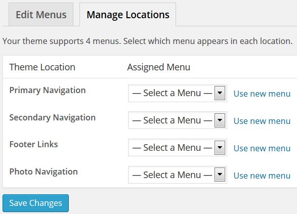
You can check if your WordPress theme includes support for custom WordPress navigation menus under “Appearance” >> “Menus” : “Manage Locations”.
Most newer WordPress themes include support for WP Nav menu theme locations to replace the older style automated WordPress navigation menu: older themes would add all Static Pages to the navigation menu with limited options for customization.
WordPress Theme Custom Navigation Menus
Stallion Responsive for example includes four WordPress Navigation Menus
Primary Navigation
Secondary Navigation
Footer Links
Photo Navigation
Other WordPress themes might have a single theme location, usually the main navigation area below the header area.
If you haven’t already created a custom menu under “Appearance” >> “Menus” we’ll have to make one first.
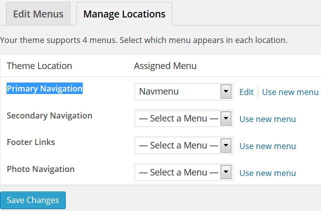
After following this WP Nav menu tutorial your “Appearance” >> “Menus” : “Manage Locations” page should look something like this:
WP Nav Menu
Go to “Appearance” >> “Menus” and if there’s no custom menus already created add the name of a new WP nav menu in the “Menu Name” form and click the “Create Menu” button, or;
If there are already existing menus first click the “create a new menu” link followed by adding the name of your new menu within the “Menu Name” form and click the “Create Menu” button.
I’m going to make a custom menu called “Navmenu” (call it anything unique) for use as the main Stallion Responsive Theme navigation menu (the menu that’s just below the header) that’s loaded in the “Theme Location : Primary Navigation”.
After clicking the “Create Menu” button we’ll have an empty Custom Menu called Navmenu ready for adding links.
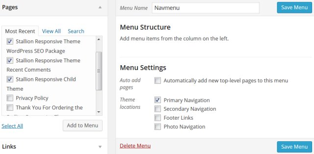
I’ve ticked a few Static Pages I want adding to my main navigation menu and ticked theme location “Primary Navigation” ready to add those links and set the theme location.
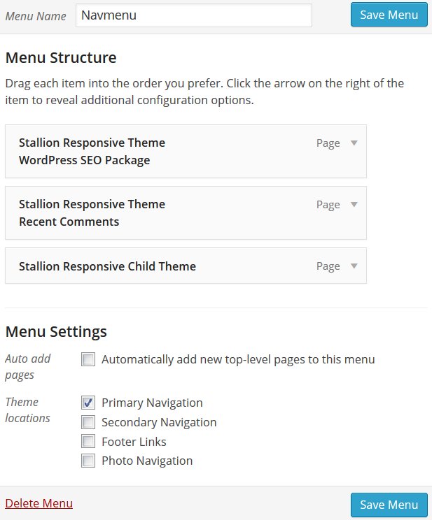
After clicking “Add to Menu” (on the left) and the blue “Save Menu” button on the right we’ll have a new custom menu with three links (to Static Pages) that’s used as the Stallion Primary Navigation menu.
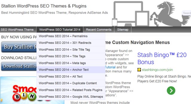
Which to your visitors would look something like this:
Looks OK, but it’s only three links and it almost fills the width of the screen (1,000px wide on a desktop PC). If I added more links it would look a mess, fortunately custom WP nav menus can be further customized including modifying the anchor text and adding dropdown options as you see on the menu for this site.
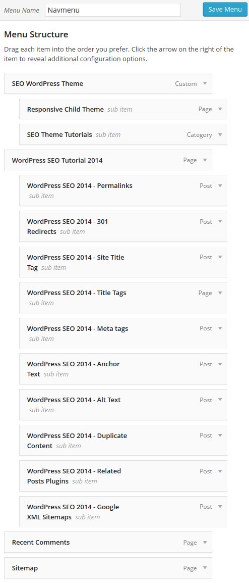
Below is a screenshot of my finished Primary Navigation menu (as it was May 2014) for this site.
What I did was add three top level menu items:
A custom link with anchor text : SEO WordPress Theme
This has two sub pages that are accessed by hovering over the anchor text “SEO WordPress Theme”
A Static Page with anchor text : WordPress SEO Tutorial 2014
This has ten sub pages that are accessed by hovering over the anchor text “WordPress SEO Tutorial 2014”
Two more Static Pages (Recent Comments and Sitemap) with no sub pages.
You may have noticed there’s a mixture of link types within my primary navigation menu that’s NOT available on your WordPress setup. WordPress by default doesn’t show Posts or Tags on the WordPress Menu Manager admin pages!
To access all link types under “Appearance” >> “Menus” click the “Screen Options” button that’s at the top right hand corner of the screen and tick all the options you want access to.
I haven’t ticked the advanced menu properties Link Target, CSS Classes, Link Relationship (XFN) or Description because I haven’t used them for this site.
Having access to Categories and Posts (I don’t use Tags on this site and don’t know what Format does) means like with Static Pages and Custom Links I can add Posts and Categories to my nav menus.
DropDown WordPress Menu
You’ll note from the screenshots above I’ve added drop down support (one leel deep) in my primary navigation menu. This is easy to achieve, to add a drop down menu link, drag and drop a link under another link, but dragged slightly to the right and it will only be available as a drop down menu item.
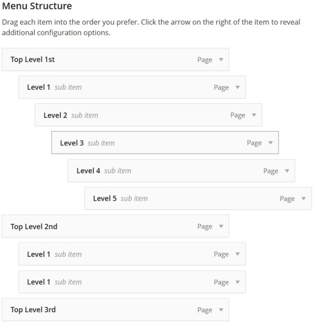
Depending on your theme you can have multiple levels of drop down links, though if you added a 10 level deep drop down menu it won’t fit on the page. I haven’t added any beyond level one for this site, but with Stallion there’s not really a limit, you could have 5+ levels deep like you see in my example below, though that didn’t quite fit on the page, the Level 5 link was just off the page.
Nav Menu Theme Options
With the Stallion Responsive and Stallion WordPress SEO Themes the Primary Navigation Menu can be completely disabled under “Stallion Theme” >> “Layout Options” : “Navigation Menu”.
Here you can turn the menus on or off, the benefit of turning them off if you aren’t using them is WordPress won’t have to load any of the WP Nav Menu code which saves server resources. With the Primary Navigation menu and the Secondary Navigation menu they use javascript for the mobile responsive version of the menus, if you don’t use nav menus turn the code off so the javascript isn’t loaded by Stallion.
David Law





WP Menu CSS Changed?
Has there been a change in something that the would cause my custom CSS menu design to change from 8.0 to 8.1?
Here is a site still on 8.0 polishgrammar.com
While here is a site on 8.1
political-economy.com The CSS is the same. I will try to figure this out, it is something simple I am sure. But if you have hint let me know.
Customize WordPress Theme CSS File
Hi Mark,
Yes the Stallion Responsive 8.1 menu CSS and corresponding HTML code has been changed a LOT to remove the need for Jquery and other javascript to generate the mobile version of the menu, means a major performance improvement as Stallion Responsive no longer needs any javascript by default.
Means if you’ve made a custom CSS file manually would probably be easier to start from the new default colour CSS file from 8.1 and recreate whatever CSS changes you made to create your custom file again.
Since I was making menu changes I changed the main menu CSS class from menu to srumenu to avoid any clashes with plugins in the future, menu as a CSS class was too general and ran the risk if a plugin used menu as a class to mess things up.
I also changed the photo navigation menu as well which is why it’s not working with your custom CSS file. With that menu removed the need for multiple javascript files, replaced the accordion javascript code with CSS code, so you’ll need the new code from the 8.1 CSS file.
Had to do this sort of update myself in the past, I find it helps to add comments to the modified files as I make the changes so it’s easy to add them to the next update, otherwise it’s a lot of hassle trying to remember what changes you made.
something like
Makes it a lot easier for copying and pasting when making updates with major customizations.
You might find it easier with this sort of major CSS code changes to add your code changes to the bottom of the CSS file you are working with (a copy in the child theme folder) or even added to the top of the mobile.css file (again copied to the child theme folder) since it’s enqueued last.
When CSS is read by a browser it’s the last rule that’s used, so if you add the same CSS code twice with changes the last version will be used, the first will be ignored.
For example at the top of the Dazzling Blue and Cayenne Theme CSS file
#wrap_stallion {
background-color: #F6F8FE;
}
If you added the same code to the bottom of the Dazzling Blue and Cayenne Theme CSS file or top of mobile.css with a different color code like:
#wrap_stallion {
background-color: #ffffff;
}
Only the last version of background-color: would be used.
Means you can copy sections of CSS code you want to change, modify it in one block making it much easier to copy to a new file during an update.
This doesn’t work with everything, you have to be able to replicate the CSS completely and change it (or add to it), so works with the CSS example above. However if you wanted to change say
.wp-pagenavi {
font: normal normal normal 175%/150% Arial, Helvetica, sans-serif;
clear: both;
margin-bottom: 10px;
}
to
.wp-pagenavi {
font: normal normal normal 175%/150% Arial, Helvetica, sans-serif;
clear: both;
margin-top: 10px;
}
You would still have the “margin-bottom: 10px;” from the first CSS rule group, so where you would just delete the line “margin-bottom: 10px;” if you didn’t want the 10px bottom margin, with the copy and change approach you still have to set margin-bottom to something to not have it set to 10px, there has to be a second copy of margin-bottom that replaces the first instance. You might use:
.wp-pagenavi {
margin-bottom: 0;
margin-top: 10px;
}
This would remove the bottom margin (set to 0) and add a top margin and the font and clear would be used from the original CSS rules.
This is actually how the mobile.css file CSS rules work, you’ll find what’s in mobile.css is copied from either the layout CSS file or the color CSS file and set to only be used when the screen width is a particular size.
You’ll find in the mobile.css file there’s 11 versions of
#wrap_stallion {
width: XXXpx;
}
Where XXX is unique to each instance, each one takes priority at a specific device width.
If you can write your CSS code so it can be added to the current CSS rather than deleting/replacing CSS code will make your updates far easier. For the most part will be copy and paste from old to new with modifications to take into account anything changed between updates like the class .menu changing to .srumenu.
David
Customize WordPress Theme CSS File
Fixed WP Navigation Issue and Moved to Child Theme
I found where the issue was. I ended up changing the class of the menu from strmenu to menu and it worked.
I used the files editor from Worpress Dashboard to modify the file “navigation-menu.php”.
Then I use FTP to move this to the child theme.
Thanks for your reply.
Responsive menu not working
Hi Dave I noticed that on my sites like political-economy.com the normal menu works and is fixed but the nice responsive menu you created does not. Do you know know a quick fix for this? Thanks, Mark
Cusomizing WordPress Themes
Since you’ve used the older Stallion Responsive code no quick fix.
The new HTML and CSS code for Stallion Responsive 8.1 is significantly better than the 8.0 code from a performance perspective.
You’ve lost your mobile menu because I stripped out the need for javascript to create the mobile menu, but you’ve added the HTML part of the code back in, but not the javascript (some jquery scripts). I removed quiet a bit of PHP code from Stallion to remove the javascript it no longer uses.
So you’ve added half a feature with poor performance metrics back in to add a little bit of CSS styling which I guess could be added to the 8.1 CSS code.
You’d have been much better off starting with Stallion Responsive 8.1 CSS code (shouldn’t need to touch the php template files) and adding CSS code you wanted (the hoverover colour stuff) to the end of the mobile.css file or the end of the colour css file.
BTW Nice hoverover menu colour feature.
David
Cusomizing WordPress Themes
Customizing Secondary Menu Appearance
Hi Dave,
I really like the idea of the secondary menu and planning to incorporate one to encourage deeper engagement. I’m just using the primary menu right now which has 6 choices for users. My menu choices lead to pages which in most cases have quite low exit % which is what I’m going for.
I’d like to use the secondary menu to a) offer more choices to promote more engagement, as the current menu is getting a bit full and b) move one or two of my current menu items to a slightly less-prominent position.
My question is, is there a way to adjust the css styling for only the secondary menu? I’d basically like to make the text itself smaller, and secondary menu bar thinner than the primary menu, to reflect the relative importance of choices on each of the menus, which is how I often see it done on sites with two menus. Basically making the secondary menu less prominent, and also I like the aesthetic of a more understated secondary menu.
Based on what I’ve tried to change it seems to me that the CSS styling controls both menus’ appearances. Is there a way to separate this out somehow so I can just adjust the appearance of the secondary menu? I checked in the CSS inline editor and unless I’ve missed it didn’t see a way to only adjust the secondary menu’s appearance.
Thanks,
Erik
Customizing Secondary Menu Appearance
Secondary WP Nav Menu Customization
To keep the CSS used to a minimum the two menus share the same rules.
If you wanted the secondary navigation menu to use a different rule set you’d need to create a second rule set.
There’s CSS classes specific to the two different ways to use the secondary nav menu:
.header_nav_box_top – For when the secondary WP nav menu isn’t fixed at the top and
.header_nav_box_top_fix – For when the secondary WP nav menu is fixed.
Depending on which version of the secondary menu you use (fixed or not) determines which of the two you’d use. I’ll use fixed for the example.
Find the general CSS rules you want to change for the secondary nav menu and make a copy. Within the colour CSS file you are using are a set of CSS rules starting .srumenu these are the menu CSS rules.
Below is one of the CSS rules.
.srumenu {
background-color: #404040;
background: -webkit-gradient(linear, left top, left bottom, from(#404040), to(#282828));
background: -webkit-linear-gradient(top, #404040, #282828);
background: -moz-linear-gradient(top, #404040, #282828);
background: -ms-linear-gradient(top, #404040 0%, #282828 100%);
background: -o-linear-gradient(top, #404040, #282828);
background: linear-gradient(top, #404040, #282828);
filter: progid:DXImageTransform.Microsoft.gradient(startColorstr='#404040', endColorstr='#282828');
clear: both;
font: normal normal normal 90%/200% Arial, Helvetica, sans-serif;
margin: 0 auto;
}
Simply making a copy of a rule and adding the .header_nav_box_top_fix to the rule will mean it only works for the fixed version of the secondary menu.
.header_nav_box_top_fix .srumenu {
background-color: #404040;
background: -webkit-gradient(linear, left top, left bottom, from(#404040), to(#282828));
background: -webkit-linear-gradient(top, #404040, #282828);
background: -moz-linear-gradient(top, #404040, #282828);
background: -ms-linear-gradient(top, #404040 0%, #282828 100%);
background: -o-linear-gradient(top, #404040, #282828);
background: linear-gradient(top, #404040, #282828);
filter: progid:DXImageTransform.Microsoft.gradient(startColorstr='#404040', endColorstr='#282828');
clear: both;
font: normal normal normal 90%/200% Arial, Helvetica, sans-serif;
margin: 0 auto;
}
By using “.header_nav_box_top_fix .srumenu” it means that CSS rule will look for an element using the .srmenu class that’s also within an element with the .header_nav_box_top_fix class.
So the original CSS rule is general, acts on all instances of .srumenu and the modified version only acts on the .srumenu that’s also within an element with class .header_nav_box_top_fix.
You could either make a partial copy and modify the rules you want to change or make an entire copy of all the CSS rules related to the menu.
If all you wanted was smaller text for example, but the same colours you only need to copy and modify the bit of the rule related to font size:
.header_nav_box_top_fix .srumenu {
font: normal normal normal 80%/200% Arial, Helvetica, sans-serif;
}
The above would have the secondary nav menu the same as the other menu, except the font size is smaller.
David
Secondary WP Nav Menu Customization