Been working on fixing Google PageSpeed Insights Size Tap Targets Appropriately warnings for this website and the WordPress theme I develop (Stallion Responsive: which is running on this site). Version 8.0 of Stallion Responsive was released (February 2014) before Google added Size Tap Targets Appropriately warnings in May 2014 (weird name for the warnings, “Appropriately”!) to it’s PageSpeed Insights Tool output: part of the new Mobile User Experience results.
Size Tap Targets Appropriately

It’s taken two days and a LOT of testing (can’t test on a localhost install, has to be with a live site) to remove almost all the size tap issues that can be removed related to Stallion Responsive, not as easy as you would think. Though a lot of the time was spent improving the Stallion color scheme CSS file creator for the v8.1 update, I have 40 Stallion color schemes CSS files to update with the new font sizes etc… and would have been a Royal PAIN to update that main CSS files, now the CSS files are created automatically within the WordPress Dashboard so much easier.
I digressed a little :-)
PageSpeed Insights Size Tap Targets Results
This is the sort of information the tool outputs regarding size tap targets.
Some of the links/buttons on your webpage may be too small for a user to easily tap on a touchscreen. Consider making these tap targets larger to provide a better user experience.
The following tap targets are close to other nearby tap targets and may need additional spacing around them.The tap target URL and 20 others are close to other tap targets.
The tap target URL and 1 others are close to other tap targets.

Ironic Google AdSense is causing about 90% of the PageSpeed Insights issues (not just the tap issues, ALL pagespeed issues) for this website and Stallion Responsive!
After all the code work the text output of this website and Stallion Responsive (will be part of version 8.1) has changed quite a bit (looks different) and I think mostly for the better.
The Size Tap Target warnings are basically Google indicating some tapable elements on your website are either too small for a user using a mobile device to tap or two or more tapable elements are too close together and a website visitor could accidentally tap the wrong link.
Based on how wide I’ve had to set some elements I think they must test websites with mobile phones with Mars bars for fingers :-)
An example was the Categories Tagcloud Widget output (you can see my current output at the very bottom of the webspage: this results in no tap size issues). Note the Tagcloud Widget (used to chow your tags and or widgets as a cloud of links) is a default WordPress widget, so I guess most theme developers are going to have to deal with this issue. Also had a warning about legible font sizes, the smallest tags (one with least posts) have a font size of 8pts (WordPress default setting), I found Google won’t throw up a warning when set to 10pts.
In Stallion Responsive 8.0 I had the tagcloud links taking up as little space as possible, I thought it looked better (changed my mind now, I’m liking to new look). The screenshot below shows Stallion Responsive v8.0 output at the top and v8.1 (currently July 2nd 2014 not released yet) at the bottom.

You might not be able to see it as well in the above image (which I reduced in size to fit the webpage) as viewing the categories widget at the bottom of this page. I think the line height and the gaps between each link is a little on the wide side, but that was pretty much the minimum line height Google PageSpeed Insights didn’t throw up any user experience issues.
Before making changes it threw out warnings related to the size of some of the tap targets (the font size was too small) and how close the links were to other links (line height was too narrow).
I had the size tap warnings through out my website (the sitemap page template had hundreds, every link was too close together), I’d built Stallion Responsive v8.0 with what I thought would be smallish font sizes and line heights etc… that were readable and looked good.
Mobile User Experience
Webmasters (those who might buy Stallion Responsive) tend to look on their websites firstly on how it looks, NOT firstly from a user experience perspective. Webpages tend to look better when fonts are small and line spacing is close together, BUT it’s much harder to read. I’m glad Google has added these metrics to their PageSpeed Insights Tool, means webmasters who care about SEO (if Google aren’t using these results today, they will in the future) must make their text legible to all web users otherwise Google is likely to rank their websites lower.
Most of the changes I’ve made I like, there’s a few changes I don’t like for example on paged archives the next and previous links when numbers (1, 2, 3…) result in the links are too small (presumably because of just one character per link) and to pass the size tap testing font size needs to be set to 200%! This made the paged archive links bigger than some of the headers, had to increase the header sizes so it didn’t look wrong.
New Mobile User Experience Results
After making the changes my Mobile User Experience results are 99/100 with three issues remaining all of which are tap target issues.
One issue is a Stallion Responsive feature, there’s a fixed TOP/BOTTOM arrow links that takes the user to either the top or bottom of the webpage. It can be fixed bottom left corner or bottom right corner. On a mobile device as you scroll up/down a page the two tap targets will hoverover other tap targets (see screenshot: click for full view, it’s hovering over an AdSense ad).
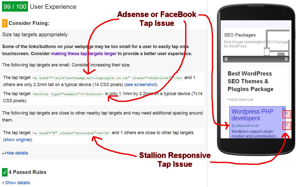
Other than decreasing the size of the main content (making the main content fit in a smaller space which would be awful for users) there’s no way to remove this tap target issue (the two arrows can be turned off, almost all Stallion features can be turned off).
The remaining tap target issues are AdSense and Facebook Like buttons issues. Within Google ads there tends to be a tiny clickable icon (I’ve pointed one of the red arrows at the icon in the screenshot above), this is considered too small by Google. The FaceBook Like button (a Stallion feature that can be turned off) again have no control over it’s output.
If I turn AdSense ads off and the Facebook button off mobile user experience is 100/100, with them on it’s 99/100. I can live with 99/100 since I like to make money from AdSense and it’s useful to have Facebook Likes.
Trying to get the Stallion Responsive v8.1 update out for the end of this month (July 2014), but I tend to fall into the feature creep trap (keep adding new features) when doing updates and keep adding new things, so…
David Law
Google PageSpeed Insights Size Tap Targets Information from Google
Size Tap Targets Appropriately
This rule triggers when PageSpeed Insights detects that certain tap targets (e.g. buttons, links, or form fields) may be too small or too close together for a user to easily tap on a touchscreen.
Overview
Small or tightly packed links or buttons are more difficult for users to accurately press on a touchscreen than with a traditional mouse cursor. To prevent users from being frustrated by accidentally hitting the wrong ones, tap targets should be made sufficiently large and far from other tap targets that a user can press them without their finger pad overlapping any other tap targets. The average adult finger pad size is about 10mm wide (a bit less than half an inch), and the Android UI guidelines recommend a minimum tap target size of roughly 7mm, or 48 CSS pixels on a site with a properly-set mobile viewport.
Recommendations
You should ensure that the most important tap targets on your site—the ones users will be using the most often—are large enough to be easy to press, at least 48 CSS pixels tall/wide (assuming you have configured your viewport properly). Less frequently-used links can be smaller, but should still have spacing between them and other links, so that a 10mm finger pad would not accidentally press both links at once. Users should not have to pinch zoom (or rely on other browser UI features for disambiguating finger taps, such as Chrome’s popup magnifying glass) in order to easily and reliably press the desired button or link.
Make important tap targets large enough to be easy to press
This applies to the tap targets your users will use the most, such as buttons for frequently-used actions, search bars and other important form fields, and primary navigational links. These tap targets should be at least 7mm (48 CSS pixels if you have configured your viewport properly), and should have additional spacing around them if they are any smaller than 7mm.
Ensure there is extra spacing between smaller tap targets
It is reasonable for infrequently-used links or buttons to be smaller than the recommended size of 7mm, but there should still be no other tap targets within 5mm (32 CSS pixels), both horizontally and vertically, so that a user’s finger pressing on one tap target will not inadvertently touch another tap target.
Website - SEO Gold


Mobile Responsive WordPress Themes
Might help with developing mobile responsive WordPress themes if I actually used a mobile phone.
I own a mobile phone, but I only use it for four things.
Taking pictures occasionally.
A bird sounds application that’s awesome for identifying birds and for some birds attracting them in.
A light.
For an emergency when out and the odd call. Think I bought the phone almost a year ago (Nokia Lumia 620 Windows 8 phone) with a Pay as You Go contract and still not used the £15 credit (about £3 left).
Don’t see the appeal of browsing websites with a tiny screen, I find it annoying.
David
Mobile Responsive WordPress Themes
Google PageSpeed
Hi, David
Will you release the new update of this stallion responsive soon? My google page speed is not good either.
Oh, I placed the single post widget but it did not work and I don’t know why. I thought I followed the right tutorial.
Thank you
Google PageSpeed Insights Tool Results
The Google PageSpeed Insights Tool results appear since May 2014 to give significantly lower results relative to before May.
When I ran this website through the PageSpeed tool in February and kept a copy of the results I had a Desktop result of 98/100, (was with no social media like buttons or AdSense ads on).
Now it’s significantly lower (Desktop 83/100 just now) even though I’ve been fixing most issues. You have to take a hit for running AdSense, their code doesn’t pass their own PageSpeed Insights tests and most of the issues are AdSense and Facebook: Nothing I can do about AdSense, might be able to do something about Facebook.
Looking for better ways to achieve things to get back into the green WITH AdSense and like buttons active (turn them off and it’s relatively easy).
Have you followed the advice on the Stallion Performance Options page? Stallion Responsive can’t do everything website performance wise, if you have a rubbish host no changes can fix that.
See “Stallion Theme” >> “Performance Options” for suggestions.
Are you running:
W3 Total Cache Plugin
EWWW Image Optimizer Plugin
I don’t add features to Stallion if there are already good well supported plugins that do exactly what I want, both the above do what I want so won’t be adding caching or image optimization to Stallion (why reinvent the wheel). Also consider the WP Optimize Plugin, it optimizes your database on a regular basis which can speed a site up a little.
Is Gravatar Cache ON?
Have you gone to “Tools >> Stallion Regenerate Thumbnails” and regenerated your images.
Regarding the single Posts widget, go to the Single Posts Widgets Tutorial create a comment there and explain what you did and we’ll go from there. Can’t diagnose and issue with so little information.
Working on releasing Stallion Responsive 8.1 before the end of July 2014, but I tend to fall into the feature creep trap (keep adding new features), so we;ll see…. The Stallion Responsive colour Scheme Creator v8.1 is awesome, the CSS files and the PHP backup (for making more modifications later) are saved to the Stallion Responsive child theme folder automatically, no need for copying and pasting and FTP to create a new colour scheme. I updated the 40 built in colour schemes with new font sizes to remove the mobile tap size issues (created new CSS and PHP backup files) in under an hour.
David
Google PageSpeed Insights Tool Results