Comment on Stallion Responsive SEO Theme Layout Options by SEO Dave.
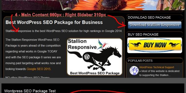 That’s a WordPress responsive theme CSS setting called max-width within the Stallion layout CSS files so images never stretch over the sidebars.
Under /stallion-seo-theme/colors/ you’ll find the layout CSS files name format layout-***.css where the *** relates to the layout used, layout-310r.css for example is the 310px wide right sidebar layout (like I use on this site).
Within those files you’ll find this CSS code:
.content_all img {
max-width: 660px;
margin: 0 0 24px 0;
}
Each file has a different max-width set, the one above is 660px for the right sidebar layout, the double sidebar layouts has it set at 560px and the no sidebars set at 970px. It’s set to take advantage of the entire content area without loading over the sidebars.
If you remove the code entirely the width of the image will determine if it loads over the sidebars or not. I find it looks unprofessional when images load over the sidebars.
David


More Comments by SEO Dave
WordPress SEO Theme Layout
WordPress Clone Plugins and SEO Theme Options
There’s isn’t an export Stallion SEO settings per se, you could of course clone a site which will cone everything if you plan to build a lot of new sites that can save a lot of time: setup one empty …
Continue Reading WordPress SEO Theme Design
WordPress SEO Theme Layout
How to Make WordPress Custom Page Templates
It’s relatively easy to make custom page templates for WordPress and especially easy with Stallion Responsive.
You have two choices.
Use the example template (made for this reason) and modify to your needs, that’s the file page-example.php
This is basically the page.php template …
Continue Reading WordPress SEO Theme Design
WordPress SEO Theme Layout
WordPress Static Page HomePage
That’s just a static page.
Created a WordPress Static Page, added content as you do :-)
“Settings” >> “Reading”
Tick “A static page (select below)”
Select the WordPress Static Page I made.
I did create a new WordPress Custom Page Template for this page which …
Continue Reading WordPress SEO Theme Design
WordPress SEO Theme Layout
Google Search Engine Optimization Guide 2015
With most of what I write about SEO it’s aiming for the best possible search engine optimized website possible.
As you’ve touched on there’s a time issue, setting 6 phrases as you write a new article is manageable, editing hundreds of …
Continue Reading WordPress SEO Theme Design
WordPress SEO Theme Layout
SEO Posts Widget Image Links
Regarding the SEO Posts widget linked thumbnail images, if you’ve updated to Stallion Responsive 8.1 you can limit the number of thumbnail images like you see on my left sidebar.
I have the popular posts widget and the recent posts widget …
Continue Reading WordPress SEO Theme Design
WordPress SEO Theme Layout
SEO WordPress Strategy 2015
For usability reasons (users come first) I wouldn’t remove the link part of the images, it would likely confuse site visitors.
Looking at your site amishamerica.com you aren’t using Stallion Responsive to it’s full SEO capabilities.
For example the links you are …
Continue Reading WordPress SEO Theme Design
WordPress SEO Theme Layout
WordPress Design Layouts
There’s dozens of Stallion layouts and color schemes each with their own CSS files, so depends what layout and color schemes you’ve set.
You’ll find all CSS files under /stallion-seo-theme/colors/ basically a site will use one layout file and one color …
Continue Reading WordPress SEO Theme Design
WordPress SEO Theme Layout
Disable WordPress Search Form
The header search form isn’t a widget it’s built in to the theme, to disable go to
Stallion Layout Options : Search Form OFF
This activates the Header Widget Area so you can add something else there via a widget: there’s limited …
Continue Reading WordPress SEO Theme Design
WordPress SEO Theme Layout
Comments WordPress Page Templates
Disabling comments on a post is a core WordPress feature, on the edit page there’s a setting.
There’s a Stallion feature under the Stallion Layout options page to turn all dates and author links sitewide off, no built in way to …
Continue Reading WordPress SEO Theme Design
WordPress SEO Theme Layout
WordPress Theme Copyright Notice Date
Changing the copyright date isn’t a theme option, it’s based on the date of your earliest post.
That being said if you don’t mind changing code, I suppose you could add any date by replacing this code with any date:
The file …
Continue Reading WordPress SEO Theme Design
WordPress SEO Theme Layout
SEO Content High in Code
In SEO theory having your most important content higher in the code as possible makes sense, BUT the actual evidence it matters a lot is weak at best.
If there is an SEO impact it’s very small.
There is an argument loosing …
Continue Reading WordPress SEO Theme Design
WordPress SEO Theme Layout
SEO vs Website Design
I completely agree, the difficulty is creating a great looking page without it costing on the SEO side.
Easy to take everything away from the home page with Stallion via the Page templates, but take out all the sidebar links etc… …
Continue Reading WordPress SEO Theme Design