Comment on WordPress Page Templates Tutorial by Mark.
 On one of my websites, I am experimenting with moving the comments from the bottom to the top of the page, under the title. This with Hovercards will help people who land on the page see it to function with a more social aspect. It could be a profile pages or even like classified ads/forum with no registration. I will have to title things right of course so people are not disoriented when they land on the page.
This combined with editing your language options from ‘Leave a reply to’ something like ‘Create your profile below” or ‘Comment title’ to ‘Profile title’ will change how people land on it use the page. It could also be something like ‘Leave your classified ad’ or ‘dating profile’ whatever you structure the site will be like.
The text rich content of the post will still be below, and with good copy it will hopefully attract some traffic. This will help mitigate the issue of on social sites and dating sites you have 1000s of profiles with pages that do little or have a negative SEO impact.
If your site page was about ‘meeting people in London who like Tattoos’ then you could write about London tatto culture or something. Above would be the comment stream with Hovercards of people who are into this and they would have a Gravatar profile or at least a comment rich in content.
Just and idea could be another site that does not work but if I design it right, it would do something.
I can organize these posts anyway that makes logical sense and searchable, even like a classified ads layout.
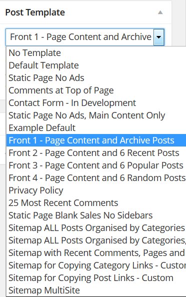
This is just an experiment. Certain pages will run this type of template, others will take a standard Post them comment style.
The problem is when I move this code:
Above to where the content is, it works but the comment box extends out too far to the right. I think it is a simple css or div thing I am missing. I tried to troubleshoot this a little but am rusty. If you have an idea where to drop this so it does not mess up my nice neat comment alignment and keep it from overlapping with the sidebar, it would be appreciated.
Maybe it would be easier for me to just create profile pages but these Hovercards look so good and it would be a unique way to use WP.

More Comments by Mark
WordPress Custom Page Templates
WordPress Landing Page Templates
Dave you have given us blank WordPress page templates for sales pages. I think one thing I have not really followed up on is making amazing looking squeeze pages for a particular product or to get someone to contact me. …
Continue Reading WP Page Templates