Comment on Stallion Responsive WordPress SEO Theme by SEO Dave.
 Almost ready to release Stallion Responsive 8.1, need a week to upload to my sites and test to make sure nothing is broken.
Added a cool set of widget features primarily for building magazine/news type front pages, but it’s so much more than that.
On the WordPress Technical Support page about two paragraphs down you’ll see two widgets within the content.
There’s no widget areas (a widget area is where you drag and drop widgets to under “Appearance” >> “Widgets”) in the center of a post, this is added via a widget shortcode (part of Stallion 8.1) which can be used to add entire widget areas anywhere.
<div class="sidebar-box"></div>
WordPress SEO Tutorial
» I wrote an SEO Tutorial some years ago (before using WP), the older search engine optimization tutorial is still very...SEO Silo Theme
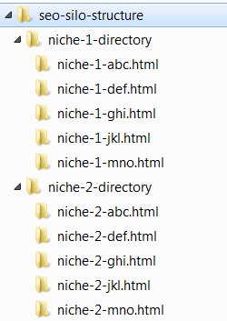
» For those not familiar with the SEO silo concept, in a nutshell you try to theme or niche every part...- Duplicate Content and Canonical URLs
- WordPress Site Title Tag SEO 2016
- WordPress SEO Tutorial 2014 Alt Text
- WordPress SEO Google XML Sitemap
- WordPress SEO Related Posts Plugins

Simplest use is as you see in the post above, paste a shortcode (see code above), go to “Appearance” >> “Widgets” and drag and drop which ever widgets you want in that shortcodes widget area.
You’ll note the two widgets are side by side which isn’t default WordPress behavior (widget stack in vertical lines filling the entire horizontal space available). To achieve this added the ability to set widgets with relative widths which allows for widgets to be added in rows.
With this new Stallion feature you can add up to 6 widgets in a row, I have two in the example post above. Each widget can have a width that’s a fraction of the available horizontal space: 1/2th, 1/3rd, 1/4, 1/5, 1/6, 2/3, 3/4, 2/5, 3/5, 4/5, 5/5 and 5/6th.
In the example each widget is set to use 1/2th : since there’s two widgets 1/2th + 1/2th = 1 so fills all the horizontal space. Could have 1/3 : 1/3 : 1/3 or 1/2 : 1/4 : 1/4 or 2/3 : 1/3 and the entire space would be used (don’t have to use it all, could have 1/2 : 1/4 and leave a gap).
Also added end of row widgets so a widget area can have multiple rows of widget.
1/3 : 1/3 : 1/3 : endrow
1/2 : 1/4 : 1/4 : endrow
That would be two rows of widgets in one widget area.
Added a spacer widget as well for if you want an empty space between widgets.
1/3 : spacer 1/3 : 1/3 : endrow
1/2 : 1/4 : 1/4 : endrow
The above would be two rows of widgets with the 2nd widget being an empty space 1/3rd the width of the horizontal space. Or as below have two widgets with 1/6th of the space either side empty.
spacer 1/6 : 1/3 : 1/3 : spacer 1/6 : endrow
Added a vertical padding endrow widget that acts as an endrow widget (as above) and adds 20px of vertical space between widgets. If you wanted the earlier widget setup, but with 40px padding between the two rows:
1/3 : spacer 1/3 : 1/3 : endrowpad : endrowpad
1/2 : 1/4 : 1/4 : endrow
As you can see the possibilities are unlimited.
ALL multiwidgets (widgets you can use multiple times) can have their width set, so will work with the default WordPress widgets, most Stallion widgets (some aren’t multiwidget) and most widgets you can find as part of plugins.
That’s what you can do with one widget area added to a post as a shortcode. What could you achieve with unlimited dynamic widget areas? New feature to create widget areas on the fly, want 10 new widget areas to use as shortcodes, just list how many you want (new Stallion options page) and use their respective shortcodes anywhere you like.
Means you could build complex front pages for magazine/news style sites, in my simple example I linked to above I’ve added the Stallion SEO Posts widget twice (it’s a multiwidget). The first widget I’ve set to 5 popular posts from the SEO Tutorial category only. The second widget same setup, but only from the category WordPress SEO Tutorial. The Stallion SEO Posts widget has new options in Stallion 8.1 to set which of the posts should have text links, thumbnail images and excerpts. For those example widgets they are set to all 5 popular posts should show a text link, but only post 1 should show a thumbnail image and an excerpt.
These are an awesome set of features. The above features are inspired by Fox News http://www.foxnews.com/ wanted to be able to mimic the front page layout of their news categories. Unlike Fox News the Stallion Responsive output is mobile responsive**
** Not decided exactly what to do with the widths for smaller screen widths yet, just have to create some mobile CSS rules to resize in small devices. Don’t want a 1/6th widget to be 1/6th the width of the screen if the screen is only 300px wide. So will add some minimum widths to force the widgets to go vertical.
David


More Comments by SEO Dave
Stallion Responsive SEO Theme
Free Premium WordPress SEO Plugins, Maybe?
As you know when I do updates it tends to be everything and the kitchen sink added to Stallion Responsive, so you’ll be missing some major feature updates. Since 8.2.2 there’s been three updates and that’s a LOT of changes, …
Continue Reading Responsive WordPress SEO Package
Stallion Responsive SEO Theme
WP Rocket Caching Plugin : Enable Caching for Mobile Devices
Hey Eric, hope things are going well.
I’m not familiar with the WP Rocket Caching Plugin (premium product) mainly as I use W3 Total Cache.
I can’t think of anything obvious that would cause an issue, all the Stallion Responsive mobile responsive …
Continue Reading Responsive WordPress SEO Package
Stallion Responsive SEO Theme
PHP Error: Warning: POST Content-Length of bytes exceeds the limit of 8388608 bytes in Unknown on line 0
That’s not a WordPress child theme issue per se, it’s not even a WordPress issue per se it’s a PHP error warning due to a PHP setting being set a bit low.
What’s happening is your post_max_size (max upload size of …
Continue Reading Responsive WordPress SEO Package
Stallion Responsive SEO Theme
Adding a WordPress Optin Form Widget
Stallion Responsive includes 26 widget areas (plus an unlimited number you can make via a Stallion feature), there’s 5 widget areas related to the header area, several of them could be used to achieve what you want by adding a …
Continue Reading Responsive WordPress SEO Package
Stallion Responsive SEO Theme
Testing the Stallion Responsive SEO Theme
The Stallion Responsive license is unlimited domains you own, so yes one off $40 for your entire network. If you sell a site with Stallion on, you need to buy a separate license.
Stallion Responsive is a theme not a plugin, …
Continue Reading Responsive WordPress SEO Package
Stallion Responsive SEO Theme
Updating a WordPress Child Theme
On the sidebars issue, if it’s the Stallion SEO Posts widgets (the popular/recent posts one) that’s playing up (blank output), go to Appearance >> Widgets and edit the widgets and click the Save button. Have added new options to the …
Continue Reading Responsive WordPress SEO Package
Stallion Responsive SEO Theme
Webpage Rendering Explained
On webpage rendering I don’t see what you see when I loaded your site, but I know what you are referring to.
As the browser loads your webpage it’s trying to rendering the content as it ‘reads’ the files from top …
Continue Reading Responsive WordPress SEO Package
Stallion Responsive SEO Theme
Google Rankings Drop After WordPress Theme Update
Highly unlikely to be due to the Stallion update, looks like a coincidence.
I checked your cache and looks like you were running Stallion Responsive 8.2.1 (released January 2015) before the update. With the 8.2.2 (released April 15th 2015) the only …
Continue Reading Responsive WordPress SEO Package
Stallion Responsive SEO Theme
Updating Stallion Responsive Child Theme
If your last update has been a while and you modified fonts manually (manually editing CSS files) you’ll probably have to start again with the modifications: not possible for me to explain how to make changes when I don’t know …
Continue Reading Responsive WordPress SEO Package
Stallion Responsive SEO Theme
Stallion Responsive 8.2.2 Update
New Stallion Responsive update version 8.2.2 includes new silo SEO options added to the Stallion SEO Posts Widget (see Popular Articles widget on menu for example output).
In Stallion v8.2.1 you could set the SEO widgets posts to be pulled from …
Continue Reading Responsive WordPress SEO Package
Stallion Responsive SEO Theme
Stallion Responsive SEO Theme Example Sites
This site runs Stallion Responsive as do:
# http://skinny-me.co.uk/
# http://www.general-election-2010.co.uk/
# http://www-news.co.uk/
Tend to use the same sort of layout, colours and settings (when you like something, tend to stick with it :-)) so doesn’t do full justice to Stallion’s options.
Have some test …
Continue Reading Responsive WordPress SEO Package
Stallion Responsive SEO Theme
Stallion Responsive and WPRobot Installation
I don’t do custom work and don’t know anyone who uses Stallion Responsive with WPRobot and offers a site building service.
Sorry I couldn’t be more helpful.
David …
Continue Reading Responsive WordPress SEO Package