Mobile Responsive User Experience
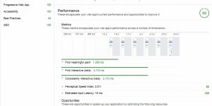
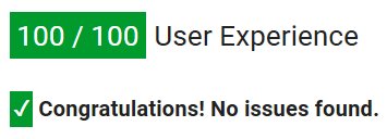
Google’s PageSpeed Insights Tool Languagenut.com Mobile Results
First the good news, 100/100 on User Experience, can’t score better than that.
What this means is visitors accessing the home page on a mobile device shouldn’t struggle to see the text (the fonts aren’t small), tap targets are a reasonable size (even huge thumbed men can handle it :-))
The viewport is configured correctly, that means the page will resize depending upon device size (basic mobile responsiveness).
Continue Reading Languagenut