Comment on Google AdSense Responsive Ad Unit Beta WordPress Theme by SEO Dave.
 Yes Google will move more towards being able to determine how a user ‘sees’ a site. You can imagine the Holy Grail for Google is to have it’s algorithm match what an average users thinks of a site, so their algo rates a site like a human would rather than on basic data like title tags and keyword usage.
I was finishing of work on the AdSense responsive code I’ve added to Stallion 8 a couple of days ago and was reading about how Google will be taking mobile responsive code into account in the organic search results in the future. They’ve rolled out their AdSense Responsive Ad Unit Beta code, the webmasters who use the new code may indicate to Google their site is mobile responsive (a positive SEO signal now or in the future?).
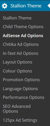
Stallion 8 by default uses the legacy AdSense code with javascript to choose the correct ad size based on device screen size (Google has approved the javascript technique as within their TOS). Stallion 8 also has a form for adding entire AdSense units to replace the legacy code used by Stallion, but it’s more work to use Stallion that way (you have to add up to 7 full AdSense ads you’ve made under your AdSense account rather than add your AdSense pub-number once). To be on the safe side after I release Stallion 8 I’ll be manually adding the AdSense Responsive Ad Unit Beta code to the Stallion AdSense options page: since I only use 3 content AdSense ads I’ll need to add 3 AdSense Responsive Ad Unit Beta codes for each site.
These things are really difficult to test SEO wise. If Google is looking for signs a site is up to date, are they looking for AdSense responsive beta code, media queries in javascript, @media screen code in CSS files…. These are signs of mobile responsive design, I’m work on the principle if a user would consider a feature useful (like ads that get smaller on mobile devices) Google will as well eventually.
The Stallion 8 update is going really well, all the important things are done. Added a new feature today: the Stallion random banner image feature was old (had it since Talian 5) and not very responsive (could only use a 560px by 120px image), scrapped that feature and started again. Have a new random banner image feature that uses the large 1000px by 288px (can use other sizes, but that’s the best size) header images (the Stallion 2011 Header Image feature). The new feature uses the 2011 header image sets, they can be selected independent of the 2011 headers and there’s an upload/select image form on post and page edit screens (every post/page can show a unique banner). The feature uses Timthumb to scale the image to match each layout size, so you upload/select one 1000px by 288px image and Stallion resizes it for each layout. It’s also mobile responsive, so the banner size decreases in size as the screen gets smaller. Since a 1000px by 288px image can be associated with every post I also added the option to use that image as the 2011 header image (unique header for every page/post). It’s a feature I’ll be using a lot.
David


More Comments by SEO Dave
AdSense Responsive Ad Unit Beta
Clear the W3 Total Cache Plugin Cache
About to go offline for about 6 hours, so quick response.
If it works when logged in, it’s working correctly.
Try clearing your W3 Total Cache cache and check logged out. Sounds like you are getting an old cached version of the …
Continue Reading Stallion Responsive Theme AdSense Beta Code