Comment on SEO AdSense WordPress Theme by SEO Dave.
 Edited comment to take into account completely getting it wrong, I advised using Smart Sizing should be use Advanced AdSense code with Stallion!
The difference between the two AdSense Responsive Ad Unit types is as follows, the two code examples are the same AdSense ad unit from my account, just the mode is changed either “Smart Sizing (recommended)” or “Advanced (code modification required)”.
Responsive AdSense code – Smart Sizing (recommended) – don’t use this code in Stallion Responsive
<script async src="//pagead2.googlesyndication.com/pagead/js/adsbygoogle.js"></script>
<!-- stradunit1 -->
<ins class="adsbygoogle"
style="display:block"
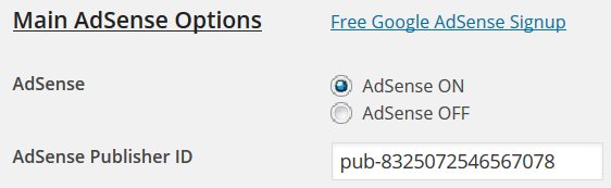
data-ad-client="ca-pub-8325072546567078"
data-ad-slot="2310085616"
data-ad-format="auto"></ins>
<script>
(adsbygoogle = window.adsbygoogle || []).push({});
</script>Google AdSense basically reads the devices screen/browser width and sets the ad size as big as possible to fit the width available. If you are running FireFox and the window is over 729px** wide it will show a 728px wide AdSense ad unit, drop the browser width window to 727px** wide it will show the next widest ad size 468px. AdSense assumes it has the full width of the browser window to show the ad.
** Not checked the actual px size each ad unit kicks in, might be 800px and 500px.
That’s fine if the ad unit is located in a part of the webpage that uses the entire browser width, but what about sidebars and main content ads! The floating ad unit has on this website no more than 660px and on the sidebar no more than 300px wide, but AdSense doesn’t know this and so would try to load the 728px wide ad units in full screen desktop PCs.
It would appear if your website has a CSS class that matches the name (for example: .stradunit1) of the Smart Sized AdSense ad unit, the ad unit doesn’t show. I guess it’s stopping the CSS code AdSense Smart sizing uses automatically and nothing shows.
<!-- stradunit1 -->
You will find in Stallion Responsive under /stallion-responsive/colors/mobile.css some CSS rules for
.stradunit1 { width: 180px; height: 150px; }
@media(min-width: 241px) { .stradunit1 { width: 250px; height: 250px; } }
@media(min-width: 321px) { .stradunit1 { width: 300px; height: 250px; } }
@media(min-width: 801px) { .stradunit1 { width: 336px; height: 280px; } }
These breaks the Smart Sizing AdSense code: which is why I use the Advanced version with edits.
This tells Google AdSense for the ad unit called stradunit1 when the particular min-widths of the device/browser use these ad unit sizes. So min-width 801px use an ad unit 336px by 280px etc… You can see for that ad unit Stallion sets 4 ad unit sizes based on device/browser width and the ad units are all rectangle/square which works well in that area as a floating ad.
The above is built into Stallion Responsive, so needs no editing by a user.
There are similar rules for stradunit2 and stradunit3 so as long as you create 3 AdSense Responsive ad units and name them stradunit1, stradunit2 and stradunit3 and put them in the right boxes on the main Stallion AdSenese options page it’s all automated.
Responsive AdSense code – Advanced (code modification required) – Use this code for Stallion Responsive
<style>
.stradunit1 { width: 320px; height: 50px; }
@media(min-width: 500px) { .stradunit1 { width: 468px; height: 60px; } }
@media(min-width: 800px) { .stradunit1 { width: 728px; height: 90px; } }
</style>
<script async src="//pagead2.googlesyndication.com/pagead/js/adsbygoogle.js"></script>
<!-- stradunit1 -->
<ins class="adsbygoogle stradunit1"
     style="display:inline-block"
     data-ad-client="ca-pub-8325072546567078"
     data-ad-slot="2310085616"></ins>
<script>
(adsbygoogle = window.adsbygoogle || []).push({});
</script>
The code is similar to the Smart Sizing with basically the CSS rules built in.
The CSS code is similar to what I’ve added to the Stallion Responsive mobile.css file, for min-width 800px we get a 728px by 90px ad unit, for the main content ad unit that’s too wide, so it would need reducing to no more than 468px by 60px. You can use the above code on the Stallion AdSense options page if you delete the style code.
To use with Stallion Responsive copy the Advanced AdSense code like the code above from your AdSense account and delete this bit:
<style>
.stradunit1 { width: 320px; height: 50px; }
@media(min-width: 500px) { .stradunit1 { width: 468px; height: 60px; } }
@media(min-width: 800px) { .stradunit1 { width: 728px; height: 90px; } }
</style>
If the user doesn’t want to use the Stallion Responsive js file (that option loads the code once in the footer rather than inline 3 times, better for performance) it’s copy the Advanced AdSense code (minus the style code above) and paste it in the box.
I recommend delete the “script async src” line from the three Advanced sizing code snippets, delete this as well:
<script async src="//pagead2.googlesyndication.com/pagead/js/adsbygoogle.js"></script>
And tick the “Add JS Script to Footer On” box, it’s the best setup AdSense performance wise.
Phew, really messed up the original advice in this comment, completely updated now.
I should check my own Stallion Responsive tutorials : see the section “Main Content Ad Unit 1 – stradunit1” at Google AdSense Responsive Ad Unit Beta Stallion Responsive WordPress Theme Integration.
David


More Comments by SEO Dave
AdSense Theme Options
AdSense Responsive Theme Code
Code doesn’t come through in WordPress unless you add code tags, so didn’t see your code, have pasted what it should look like to replace the messed up code.
If your code looks like that, should work. Must be exactly like …
Continue Reading Stallion AdSense Theme
AdSense Theme Options
Google AdSense Custom Search Widget
The Stallion Responsive 8.2 version of the Google AdSense Custom Search Widget is called “Stallion AdSense Google Search Widget”.
For performance reasons some of the Stallion widgets and default WordPress widgets are disabled. Basically if you don’t use a widget it’s …
Continue Reading Stallion AdSense Theme
AdSense Theme Options
DED : You’ve Reached your Daily Relay Quota
Yep, Google changed a while ago to show users what they are searching for as ads. Can get quite irritating when doing research, shows me ads I have no interest in: not that I ever click AdSense ads on any …
Continue Reading Stallion AdSense Theme
AdSense Theme Options
How to Remove Malware Ads
Had a look at the home page code and the code of a WordPress post and don’t see anything obvious untoward.
I see the correct AdSense ads when viewing your site, I saw some ads about roofing and others about SEO …
Continue Reading Stallion AdSense Theme
AdSense Theme Options
AdSense Troubleshooting
Assuming you are running either Stallion Responsive or Stallion WordPress SEO.
Most times AdSense doesn’t work it’s because the user has inadvertently copy pasted additional characters (tabs or spaces) which breaks the code.
Check before and after for spaces, should only be:
pub-123456789
Assuming …
Continue Reading Stallion AdSense Theme
AdSense Theme Options
Adding HTML code to a WordPress Post
Have you viewed the HTML source of the AdSense output that’s not working and compared it to the original AdSense code?
This will tell you if it’s WordPress changing your HTML after saving.
Easy to do.
Add the responsive ad code that isn’t …
Continue Reading Stallion AdSense Theme
AdSense Theme Options
Adding Responsive AdSense Code to a WordPress Post
When you say adding a Responsive AdSense ad to a WordPress page do you mean editing a page template (one of the files ending .php) and manually adding the AdSense code where you want it?
Or editing a WordPress Page or …
Continue Reading Stallion AdSense Theme
AdSense Theme Options
Advanced AdSense Responsive Ad Units
I need to get more sleep apparently, managed to replicate your issue by using the Smart Sizing AdSense Responsive Ad Code.
Where ever I suggested using Smart Sizing AdSense Responsive, should be use Advanced AdSense Responsive ad units and delete the …
Continue Reading Stallion AdSense Theme
AdSense Theme Options
AdSense Responsive adsbygoogle.js File
One possibility is you are using broken AdSense code.
The AdSense responsive code I use on this site lacks this code:
<script async src="//pagead2.googlesyndication.com/pagead/js/adsbygoogle.js"></script>
Which means my AdSense ads code is broken (incomplete), but because Stallion Responsive includes the adsbygoogle.js code link it …
Continue Reading Stallion AdSense Theme
AdSense Theme Options
Responsive AdSense Ad Units Placement
The main Ad ON/OFF options are designed for the built in AdSense code including what you add on the main Stallion AdSense Options page form boxes. If an ad is turned off on the main AdSense options page that ad …
Continue Reading Stallion AdSense Theme
AdSense Theme Options
AdSense Responsive Ad Units
Updated to take into account a brain fart, see later comment.
Sounds like you are using the widget area correctly.
I’ve just tested two scenarios that worked as expected (update: I was wrong).
On this website under “Appearance” >> “Widgets” made sure I …
Continue Reading Stallion AdSense Theme
AdSense Theme Options
AdSense Ad Unit Placement
Oh I see, you mean under “Stallion >> AdSense Options” setting “Main Content Ad Unit – Ad Unit 1” to “off” turns that AdSense ad unit off sitewide.
That’s what the setting is supposed to do.
Turn it back on and use …
Continue Reading Stallion AdSense Theme