Comment on How to Add AdSense to WordPress by SEO Dave.

AdSense has released responsive AdSense code, it’s Responsive Ad Unit Beta. When you add a responsive ad unit to a site (by going to your AdSense account, create a Responsive Ad Unit Beta including setting font colours etc… and copy and paste the entire code to a theme/plugins options page) AdSense will automatically choose the best ad size for the device size, basically it will scale down.
The problem with this approach is it sucks for WordPress theme and plugin developers and the user, we have to supply a form for entering entire ad units that the user has to create under their AdSense accounts (to replicate what Stallion 7 does you’d need to create 7 AdSense ad units) and this tends to result in copy and paste mistakes: In Stallion 7 (and Stallion 8) all you have to add is the pub-############ code once, yet I’ve had dozens of support requests due to mistakes in copying and pasting!
Currently testing Stallion 8 live at http://www.seo-consultant-services.co.uk/. I can’t show every feature on one site, but you can see the responsive AdSense ads in action and the top header image responsiveness including Stallion 8s new responsive navigation menu.
Easiest way to test the mobile responsiveness of a site on a desktop PC is load it in a browser (Firefox, IE, Chrome…) and slowly reduce the size of the browser window: this quickly emulates various device widths (I don’t own a dozen mobile phones for testing :-)) and it’s much quicker than using a mobile device emulator.
Stallion 8 is mobile optimized for the following device screen widths : 1,000px (Desktop), 800px 720px 640px 600px 540px 480px 400px 360px, 320px and 240px. I believe this covers the vast majority of device widths, if anyone thinks I’ve missed some…
David


More Comments by SEO Dave
Adding AdSense to WordPress
Adding AdSense Responsive Ad Unit Beta to WordPress Themes
In Stallion 8.0 not only are the default Stallion AdSense ads mobile responsive, but you can use the new AdSense Responsive Ad Unit Beta code.
In Stallion 8.0 each AdSense ad unit (there’s 7 of them: 4 content ad units and …
Continue Reading WordPress AdSense Widget
Adding AdSense to WordPress
How to Add AdSense to WordPress.com
As you are hosting your WordPress blog on the free WordPress.com site I’m afraid you can’t add AdSense to your site.
With wordPress.com hosted blogs you are only allowed to use the themes they have installed and none of them include …
Continue Reading WordPress AdSense Widget
Adding AdSense to WordPress
Add AdSense to a WordPress Blog
When you added the AdSense code did you make sure you didn’t add a space or tabs before/after your AdSense Publisher pub-######## number?
When you look at the AdSense code there should be no spaces between the speech marks.
Correct AdSense publisher …
Continue Reading WordPress AdSense Widget
Adding AdSense to WordPress
How to Add Google AdSense to WordPress Home Page
Glad you got some of it working :)
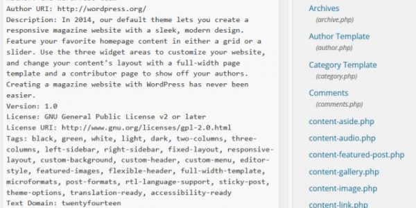
The WordPress main page is usually the index.php file, but some themes don’t follow that convention.
Also look for-
Archive(s).php and even Categories.php all depends on what the theme creator used at the time!
One of …
Continue Reading WordPress AdSense Widget
Adding AdSense to WordPress
Add AdSense to Free Hosted WordPress Blogs
This will only work with the hosted version of WordPress, so not with wordpress.org (or is it com) which gives free hosted WordPress blogs.
David Law …
Continue Reading WordPress AdSense Widget
Adding AdSense to WordPress
Copyright Infringement DMCA Complaint
If your asking to copy my content to your site then no, that’s copyright infringement and may result in a DMCA complaint from yours truly :-)
If you mean can you use my tips to add AdSense to your site then …
Continue Reading WordPress AdSense Widget
Adding AdSense to WordPress
Creating AdSense/SEO WordPress Themes
I don’t make custom themes, mainly because adding AdSense/SEO takes so much time (would cost £100s at my SEO rates).
I’m adding more WordPress themes to the site over time (hard to find the time) so if there’s one you want …
Continue Reading WordPress AdSense Widget
Adding AdSense to WordPress
AdSense Tutorial Update
Hi BallparkBob,
Sorry for taking so long to respond (so many blogs to moderate!).
Have updated this page to include instructions for adding AdSense to WordPress 2.5.
David …
Continue Reading WordPress AdSense Widget
Adding AdSense to WordPress
Add AdSense Ads
Look though the template pages for this-
div class=”postentry”
Then using trial and error post the AdSense code, if it’s the wrong template page remove it and try the next one. Eventually you’ll find the right page :-)
David …
Continue Reading WordPress AdSense Widget
Adding AdSense to WordPress
WordPress AdSense Plugins
Hi Pufone,
It is much easier to use an AdSense WordPress plugin, however I’ve not seen an AdSense plugin yet that puts the AdSense ads in the right place, for example Mutube Adsense Manager appears to only ad ads to the …
Continue Reading WordPress AdSense Widget
Adding AdSense to WordPress
How to Add AdSense to Default WordPress Theme
Hey Perry,
Not tried adding AdSense to the classic theme (there is a theme called classic), I’ve got it on the server. Had a look and didn’t see a post page for that theme though, which would mean it uses the …
Continue Reading WordPress AdSense Widget