The Stallion Responsive Premium WordPress Theme includes mobile responsive AdSense ads by default, but the code used is not the best AdSense code possible for performance (how fast your site loads) which is increasingly important to Google search engine rankings.
Below I’ll explain how to build the best possible mobile responsive AdSense code using the new Google AdSense Responsive Ad Unit Beta code AND the end result is even better than integrating AdSense manually.
If you improve site performance, Google web search should send you more traffic, which means you make more money from AdSense.
What is Google AdSense Responsive Ad Unit Beta?
The new AdSense Responsive Ad Unit Beta units after being setup correctly automatically resize based on screen size, so if you are using a mobile phone the ads will be smaller than when using a desktop PC. The javascript for the AdSense Responsive Ad Unit Beta units also loads asynchronously, which basically means it loads faster than the old AdSense code.
Stallion Responsive by default includes mobile responsive AdSense ad units, but they are built on the old AdSense code which doesn’t load asynchronously, so performance wise they are not the best (they are good, but not the best). There is no way to incorporate Google AdSense Responsive Ad Unit Beta units into a WordPress theme without the user creating the beta units within the Google AdSense Control Panel, so they require a little more effort than activating AdSense ads in Stallion Responsive.
You will find on the Stallion AdSense Options page boxes for adding entire ad unit code, the first three boxes labeled Full AdSense Ad Unit Code is where we’ll be adding our code.
Log into your AdSense Control Panel and we’ll create three new AdSense Responsive Ad Unit Beta units under My Ads > +New Ad Unit.
Main Content Ad Unit 1 – stradunit1
For the 1st unit use the following settings.
Name: stradunit1 – it is essential it has this name.
Ad Size: Responsive ad unit (BETA) – must be this unit type, surprisingly unlike all other options it can not be changed later!
Other settings are important, but up to you, choose whatever colour you want etc… the above two settings are the important ones for integration into Stallion Responsive.
Save the new beta ad unit and you’ll have the option of Smart Sizing or Advanced, select Advanced (this is important) and copy the beta ad unit code, it will look something like this:
<style>
.stradunit1 { width: 320px; height: 50px; }
@media(min-width: 500px) { .stradunit1 { width: 468px; height: 60px; } }
@media(min-width: 800px) { .stradunit1 { width: 728px; height: 90px; } }
</style>
<script async src="//pagead2.googlesyndication.com/pagead/js/adsbygoogle.js"></script>
<!-- stradunit1 -->
<ins class="adsbygoogle stradunit1"
style="display:inline-block"
data-ad-client="ca-pub-8325072546567078"
data-ad-slot="2310085616"></ins>
<script>
(adsbygoogle = window.adsbygoogle || []).push({});
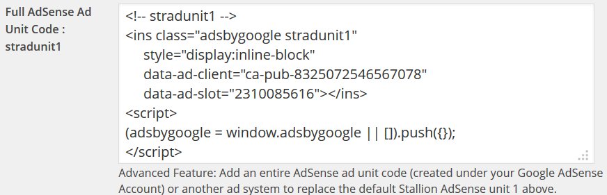
</script>The code below is what we copy and paste into the Full AdSense Ad Unit Code : stradunit1 form on the Stallion AdSense options page, the remaining code isn’t needed (Stallion Responsive has this code built in with improvements).
<!-- stradunit1 -->
<ins class="adsbygoogle stradunit1"
     style="display:inline-block"
     data-ad-client="ca-pub-8325072546567078"
     data-ad-slot="2310085616"></ins>
<script>
(adsbygoogle = window.adsbygoogle || []).push({});
</script>
Should look like the screenshot below-
Tick the Add JS Script to Footer On box on the next option (this loads the JS AdSense file in the footer rather than inline, good for performance) and Save Settings.
Ad Unit 1 is done, you will find the floating AdSense ad unit uses the ad colours you set under the Google AdSense Control Panel, not the colours set on the Stallion AdSense Options page for this unit and the ad will resize based on screen size.
Repeat the procedure for units 2 and 3 with the following settings.
Movable Content Ad Unit 2 – stradunit2
For the 2nd unit use the following settings.
Name: stradunit2
Ad Size: Responsive ad unit (BETA)
Instructions as described for stradunit1.
The code you copy and paste into the Full AdSense Ad Unit Code : stradunit2 should look similar to this:
<!-- stradunit2 -->
<ins class="adsbygoogle stradunit2"
     style="display:inline-block"
     data-ad-client="ca-pub-8325072546567078"
     data-ad-slot="3786818816"></ins>
<script>
(adsbygoogle = window.adsbygoogle || []).push({});
</script>
The parts that should be different are the data-ad-client (ca-pub-8325072546567078) and the data-ad-slot (3786818816). The data-ad-client is unique to your account (your AdSense publisher number), the data-ad-slot is unique to that ad unit.
Sidebar Content Ad Unit 3 – stradunit3
For the 3rd unit use the following settings.
Name: stradunit3
Ad Size: Responsive ad unit (BETA)
Instructions as described for stradunit1.
The code you copy and paste into the Full AdSense Ad Unit Code : stradunit3 should look similar to this:
<!-- stradunit3 -->
<ins class="adsbygoogle stradunit3"
     style="display:inline-block"
     data-ad-client="ca-pub-8325072546567078"
     data-ad-slot="5263552012"></ins>
<script>
(adsbygoogle = window.adsbygoogle || []).push({});
</script>
The three code snippets above are active ads from my AdSense account, so if you find something isn’t working try one of them with your site, if it still doesn’t work it’s probably not the AdSense code at fault (if a domain is banned from the AdSense program ads don’t load, check your domain at http://www.isbanned.com ).
Do not click your own AdSense ads, you’ll get your AdSense account banned
You now have three AdSense for Content ad units using the new Responsive Beta code. I haven’t set the remaining ad units to use the beta code.
If you want to understand what we’ve done, the first part of the AdSense Beta code (see below) we didn’t copy and paste includes the inline CSS styling which tells AdSense what size ad to load for different screen sizes and the main AdSense javascript file that Stallion Responsive loads in the footer area..
<style>
.stradunit1 { width: 320px; height: 50px; }
@media(min-width: 500px) { .stradunit1 { width: 468px; height: 60px; } }
@media(min-width: 800px) { .stradunit1 { width: 728px; height: 90px; } }
</style>
<script async src="//pagead2.googlesyndication.com/pagead/js/adsbygoogle.js"></script>
The default sizes in the code above (just three of them) are a 320px by 50px ad unit for small screens (anything below 500px screen size), a 468px by 60px ad unit for screens 500px to 799px and a 728px by 90px ad unit for screens 800px+ (Desktop PCs). These are the wrong screen sizes and ad sizes for most sites, so Stallion Responsive has many more built in for those three ad units. Below are the CSS styles built into Stallion Responsive for each ad unit.
.stradunit1 { width: 180px; height: 150px; }
@media(min-width: 241px) { .stradunit1 { width: 250px; height: 250px; } }
@media(min-width: 321px) { .stradunit1 { width: 300px; height: 250px; } }
@media(min-width: 801px) { .stradunit1 { width: 336px; height: 280px; } }
.stradunit2 { width: 180px; height: 150px; }
@media(min-width: 241px) { .stradunit2 { width: 250px; height: 250px; } }
@media(min-width: 321px) { .stradunit2 { width: 300px; height: 250px; } }
@media(min-width: 361px) { .stradunit2 { width: 320px; height: 50px; } }
@media(min-width: 481px) { .stradunit2 { width: 468px; height: 60px; } }
@media(min-width: 721px) { .stradunit2 { width: 728px; height: 90px; } }
@media(min-width: 801px) { .stradunit2 { width: 728px; height: 90px; } }
.stradunit3 { width: 180px; height: 150px; }
@media(min-width: 241px) { .stradunit3 { width: 250px; height: 250px; } }
@media(min-width: 321px) { .stradunit3 { width: 300px; height: 250px; } }
@media(min-width: 361px) { .stradunit3 { width: 320px; height: 50px; } }
@media(min-width: 481px) { .stradunit3 { width: 468px; height: 60px; } }
@media(min-width: 721px) { .stradunit3 { width: 728px; height: 90px; } }
@media(min-width: 801px) { .stradunit3 { width: 300px; height: 250px; } }
As you can see they cover many more screen sizes and ad unit sizes that work perfectly with Stallion Responsive. The CSS code above is within the Stallion Responsive mobile.css file, the benefit of loading in the mobile.css file instead of inline is a performance improvement.
The final line of code we didn’t copy and paste is the AdSense js file, the benefit of loading this file in the footer is again improved performance AND we only load it once. If you manually added the AdSense beta code three times verbatim it would be loaded three times!
By naming the three Beta Ad Units as described above and only copying the part of the code not already included in Stallion Responsive we’ve removed three blocks of inline CSS (replaced by the CSS in the mobile.css file) and prevented the AdSense javascript file from loading unnecessarily (we load it once in the footer rather than three times inline).
We could still add entire AdSense Responsive Beta Ad Units to those boxes with different ad names (we use the ad names stradunit1, stradunit2 and stradunit3 because the ad name is used by AdSense as a CSS class which I’ve added to the mobile.css file) and generate your own inline CSS (or even add your own to a child theme CSS file), but those IMO are the best ad sizes for the screen sizes Stallion Responsive is designed to work with.
David Law
Website - SEO Gold


AdSense Responsive WordPress Theme
I think to stay ahead of the curve you have to incorporate the next wave (mobile) into the equation of SEO. In the old days you could download a version of the WordPress All in One plugin, understand something about title tags and you would be all set.
Now we know post Panda (and it is not going away) if it is good for the user then it is good for SEO. If Google is not looking directly at user metric for ranking, I think they are, then some derivation of that.
I am confident from people who say they know people, that responsiveness, Mobile readiness is an important factor, as well as page load time and behavior onsite (how people navigate though your site). If you can keep people on and coming back with a nice minimalist design or arrows that lead them around (users are disoriented when then land on a site)then SEO ranking will improve. I am testing different design techniques like literally “arrows” that point people to “go here”.
AdSense Responsive WordPress Theme
Google Search Results and Mobile Responsive Design
Yes Google will move more towards being able to determine how a user ‘sees’ a site. You can imagine the Holy Grail for Google is to have it’s algorithm match what an average users thinks of a site, so their algo rates a site like a human would rather than on basic data like title tags and keyword usage.
I was finishing of work on the AdSense responsive code I’ve added to Stallion 8 a couple of days ago and was reading about how Google will be taking mobile responsive code into account in the organic search results in the future. They’ve rolled out their AdSense Responsive Ad Unit Beta code, the webmasters who use the new code may indicate to Google their site is mobile responsive (a positive SEO signal now or in the future?).
Stallion 8 by default uses the legacy AdSense code with javascript to choose the correct ad size based on device screen size (Google has approved the javascript technique as within their TOS). Stallion 8 also has a form for adding entire AdSense units to replace the legacy code used by Stallion, but it’s more work to use Stallion that way (you have to add up to 7 full AdSense ads you’ve made under your AdSense account rather than add your AdSense pub-number once). To be on the safe side after I release Stallion 8 I’ll be manually adding the AdSense Responsive Ad Unit Beta code to the Stallion AdSense options page: since I only use 3 content AdSense ads I’ll need to add 3 AdSense Responsive Ad Unit Beta codes for each site.
These things are really difficult to test SEO wise. If Google is looking for signs a site is up to date, are they looking for AdSense responsive beta code, media queries in javascript, @media screen code in CSS files…. These are signs of mobile responsive design, I’m work on the principle if a user would consider a feature useful (like ads that get smaller on mobile devices) Google will as well eventually.
The Stallion 8 update is going really well, all the important things are done. Added a new feature today: the Stallion random banner image feature was old (had it since Talian 5) and not very responsive (could only use a 560px by 120px image), scrapped that feature and started again. Have a new random banner image feature that uses the large 1000px by 288px (can use other sizes, but that’s the best size) header images (the Stallion 2011 Header Image feature). The new feature uses the 2011 header image sets, they can be selected independent of the 2011 headers and there’s an upload/select image form on post and page edit screens (every post/page can show a unique banner). The feature uses Timthumb to scale the image to match each layout size, so you upload/select one 1000px by 288px image and Stallion resizes it for each layout. It’s also mobile responsive, so the banner size decreases in size as the screen gets smaller. Since a 1000px by 288px image can be associated with every post I also added the option to use that image as the 2011 header image (unique header for every page/post). It’s a feature I’ll be using a lot.
David
Google Search Results and Mobile Responsive Design
Adsense Ads Not Displaying
When I created my ads as you described I could not select “AdSense Responsive Ad Unit BETA” — on Google it only says Responsive not Beta. So, this is what I selected and created my ads. Then pasted the code into my Adsense Options page in the appropriate places.
The only time I actually see the ads appear is when I view my site (www.Cannabis-Seeds-Canada.ca) while being logged in. As soon as I log out the ads are not visible.
Also, different from what you discussed above is my original code BEFORE deleting anything:
Your sample has a lot more code in it. So, the only thing I deleted was:
I set the following:
– Main Ad Content ON;
– Movable Content Ad Unit ON, BELOW FOOTER, 780 X 90 LEADERBOARD, Text and Image, adsense channel selected
– Sidebar Ad Unit ON, SMALL SQUARE, text/image, hide advert heading, white background.
And I am left with the rest which seems to match yours. I did set the Sidebar Ad Widget settings to the following:
– small square 200 x 200
– text and image ads
– Hide advert heading on widget (selected)
– white background
– did not select an adsense channel (not sure if this is needed or can be left blank)
And the settings on the Stallion Adsense Content S1 widget I selected are the following:
– hide on checked
– show/hide on ALL paged 1,2,3… + single posts
– width = full
– nothing else selected or checked
Did I do something wrong? Oh, by-the-way I did check to see if I was banned by Google and I am NOT. So at least that doesn’t seem to be an issue. Got any ideas?
Thanks
Adsense Ads Not Displaying
Clear the W3 Total Cache Plugin Cache
About to go offline for about 6 hours, so quick response.
If it works when logged in, it’s working correctly.
Try clearing your W3 Total Cache cache and check logged out. Sounds like you are getting an old cached version of the site.
Update: Checked your site, you’ve got the wrong AdSense code, your code is like this:
<!-- stradunit* -->
<ins class="adsbygoogle"
     style="display:block"
     data-ad-client="ca-pub-0000000000"
     data-ad-slot="0000000000"
     data-ad-format="auto"></ins>
<script>
(adsbygoogle=window.adsbygoogle||[]).push({});
</script>
should be like this:
<!-- stradunit* -->
<ins class="adsbygoogle stradunit*"
     style="display:inline-block"
     data-ad-client="ca-pub-0000000000"
     data-ad-slot="0000000000"></ins>
<script>
(adsbygoogle = window.adsbygoogle || []).push({});
</script>
You must have used the wrong AdSense Responsive options as you created the ads. another Stallion Responsive user had the same problem, go re copy the code fro your AdSense account and select the options discussed in the tutorial.
David
Clear the W3 Total Cache Plugin Cache
Number of adsense ads on a page
I’ve counted 8! ads by google on this page. How did you managed to do that? What are the ads with the “Ad” on a green background (5 of them form 8)?
And what are the settings for Stallion that an ad is showed in the middle of other people’ comment?
Fantastic!